An Experience Design Project for Art Halland
Art Halland asked us to make Halland's art landscape easier to discover, understand and navigate in a way that feels meaningful and accessible, without taking over the role of the individual venues.
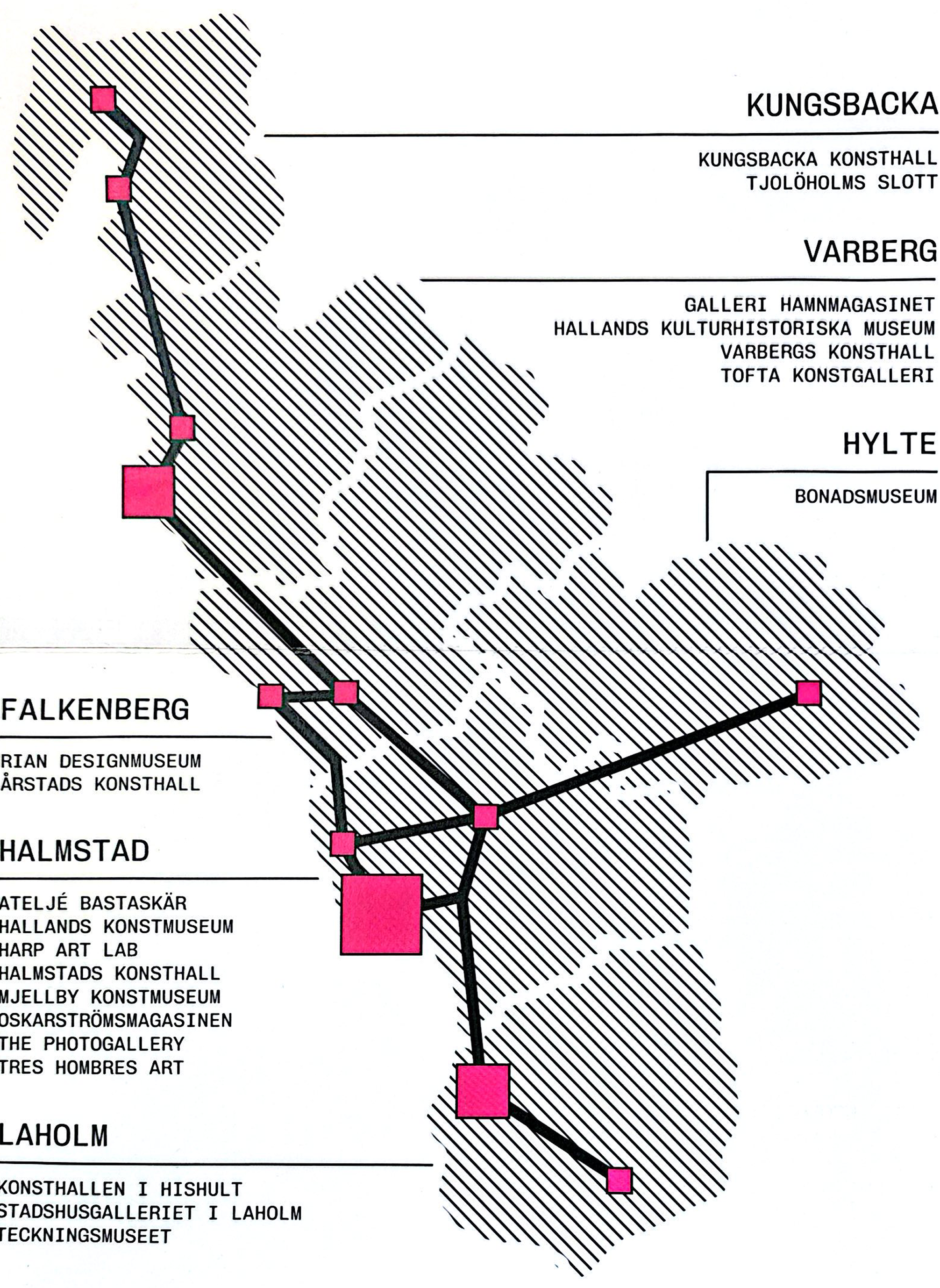
22 art institutions spread across 6 municipalities. Museums, galleries, art labs, design spaces. Each one independent with its own identity and audience.
No central discovery point. No shared entry experience. People living nearby often do not know most of these places exist.
A brand new initiative with the ambition to position Halland as an art destination. The question was how to make that real for someone who has never thought of Halland that way.

"I've always liked art, but I've never been to an art event."
"I never know it's going to happen on certain days. I just stumble upon it."
"Art feels often more fancy or posh. It has that vibe — very lofty. Like sometimes snobby."
Students and young adults in Halmstad are curious about art but consistently fail to engage because the entire journey from discovery to attendance is fragmented, impersonal, and subtly signals that art is not meant for them.
How might we create an art discovery experience that helps curious students and young adults in Halmstad feel that art is accessible, relevant, and meant for them by making the journey from discovery to attendance simple, rewarding, and low-friction?
Sara
22 years old · International student · Halmstad University · Just arrived in Sweden
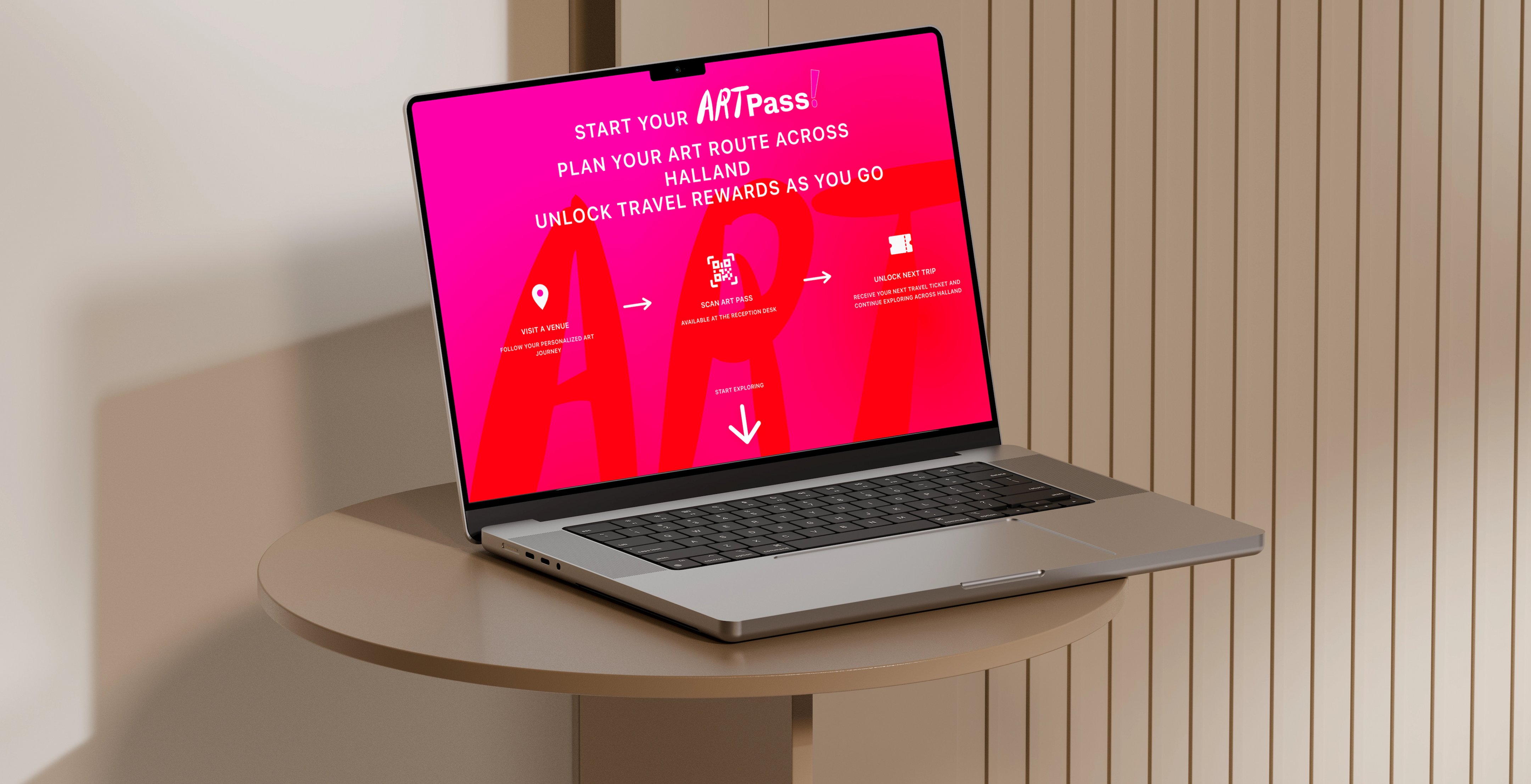
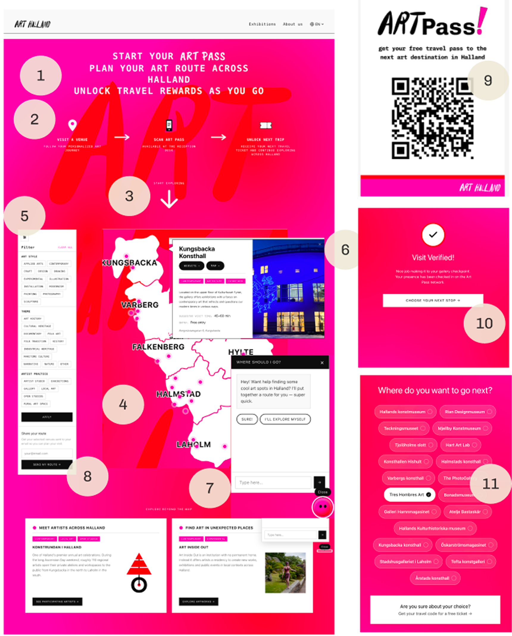
A digital and physical experience that begins on arthalland.se that helps international students discover, plan and travel between art venues across Halland and earn free travel tickets for showing up.
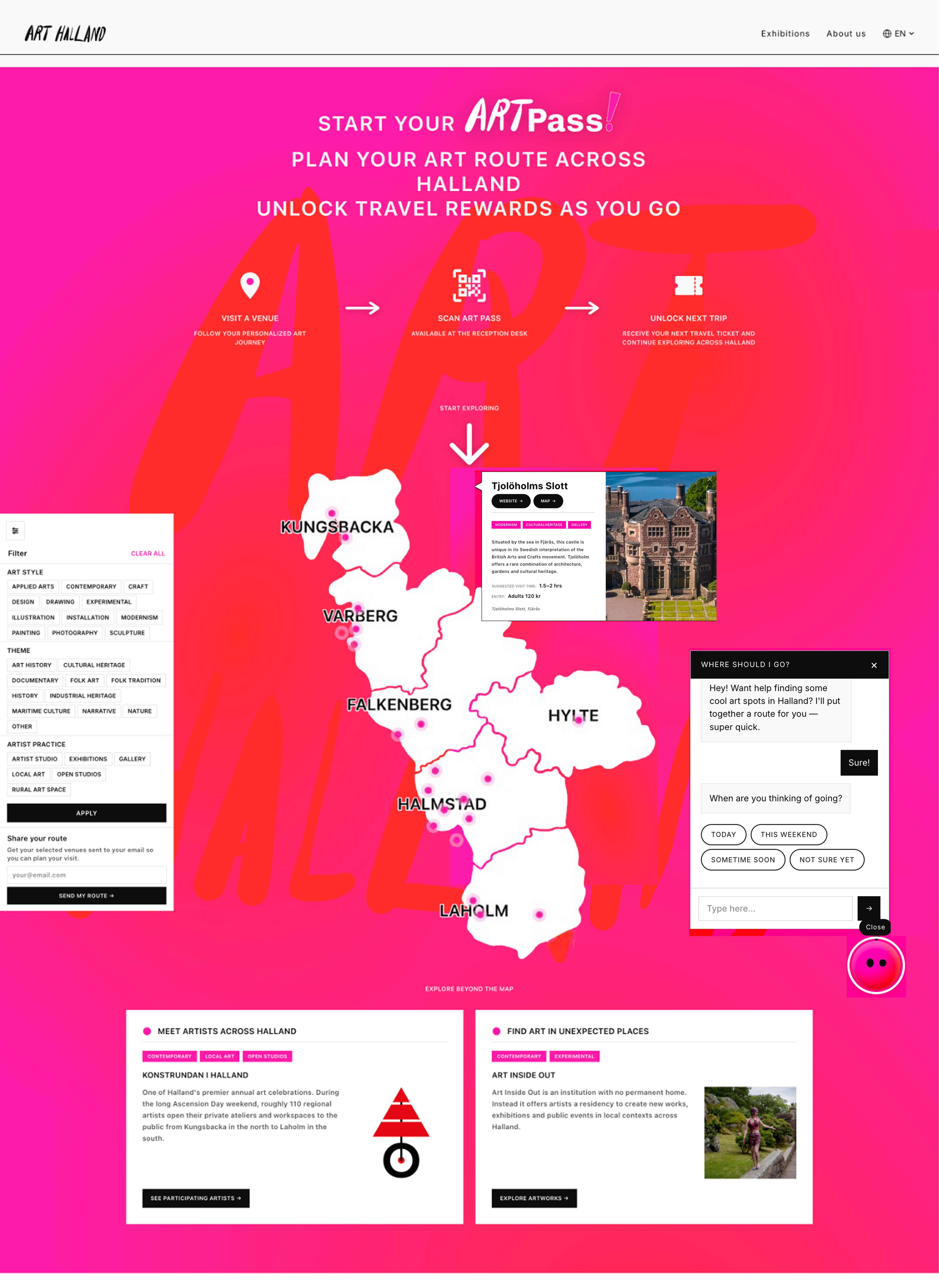
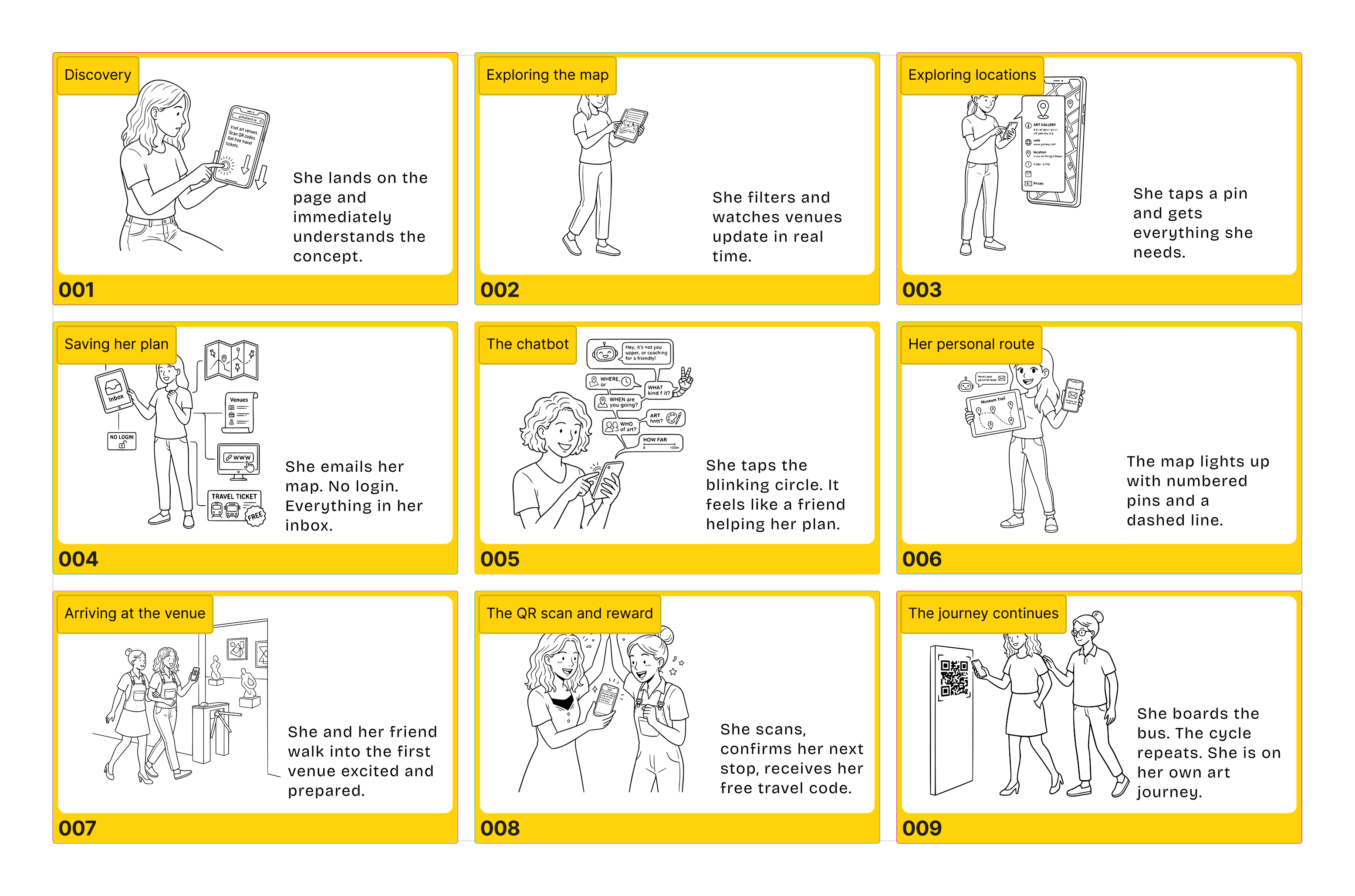
Sara needs to understand the concept in seconds or she will scroll past. The hero communicates visit, scan, ride free in one glance.
Sara may not understand how bus discounts connect to art venues. Three steps remove the confusion before she starts.
A small nudge that tells her there is more below without her having to wonder.
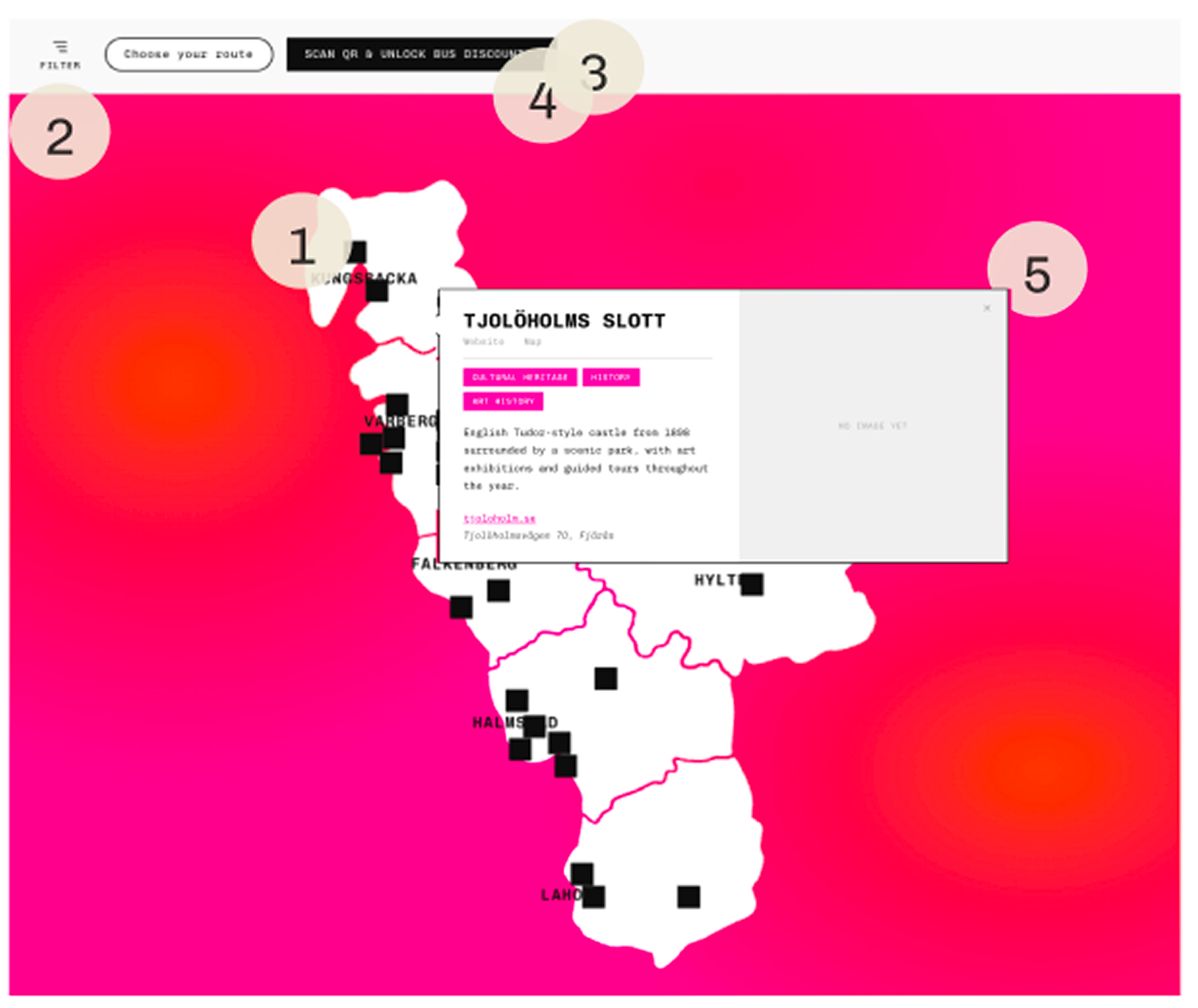
Sara needs to feel Halland is explorable before committing. 20 venues visible on one map, each tappable with full information.
Sara comes from a different background with her own interests. Three filter groups give her agency to choose what feels relevant personally.
Sara wants to know what to expect before she leaves the house. Each card shows visiting time, entry price and directions.
Sara does not know where to start. Five questions build a personal route. It feels like a friend helping her plan.
Sara explores casually and forgets. Her route lands in her inbox. No account, no password.
The reward needs to feel earned. The code only works when Sara is physically at the venue.
Sara is cost conscious. A free Hallandstrafiken ticket makes the next stop feel like a natural continuation.
One visit should not be the end. After each venue Sara chooses her next stop. Curiosity becomes momentum.
Permissions, maintenance, content creation. The best entry point uses what already exists. We built into arthalland.se instead of creating new physical infrastructure.
Distribution, printing, managing stamps across 22 institutions. Too much for a brand new initiative. → We went digital. Same concept, no operational weight. Letting go of it was hard. It was the right call.
User testing showed having both a filter and a route panel felt redundant. Picking from a list does not feel personal. A chatbot replaced two overlapping tools with one conversation that makes the route feel made for you.
Coordination, staffing, scheduling. The first experience needs to ask almost nothing from the user. Email instead of login. QR scan instead of digital check in. Every step designed to lower the effort of the next one.
We started with Claude Code because it was the fastest way to get a working prototype ready for user testing. When it stopped giving us the results we needed, we moved to Lovable to continue the build. The chatbot replaced route cards because users in testing were confused about why both filters and routes existed. The chatbot builds a personal route based on interests, starting location, and time available, then filters give users agency to explore further. We chose email over login so users can save their route without creating an account.
Art signals exclusion before anyone walks in. That is not an awareness problem. It is a belonging problem.
What makes this an art passport and not a food passport? The mechanic is the same. But food has no belonging barrier. Art does. The passport gives someone permission to be there.
The physical passport was my darling. Killing it was right. The experience matters more than the object.
AI tools accelerate execution, not thinking. Vibe coding requires more rigorous design thinking upfront, not less.
I came into this project thinking good design means having the right idea. I am leaving it knowing that the right idea means nothing if it cannot actually happen.
"One of the biggest learning moments was when the client pushed back on the physical passport, kiosk, and workshop concepts. We had spent a lot of time on those ideas. Having to let them go taught me that you don't need to go big to have impact. A small digital feature, done well, can do more than a complex physical system. The right idea is not always the ambitious one, it's the one that can actually happen."