
Back to portfolio
UX/UI Design · SaaS Platform · 2025

Candidate Assessment Platform

Designing for Trust in High-Stakes Moments

This case study is anonymized due to NDA. The company name and visuals have been altered; the client testimonial below is real and used with permission.
Role
Solo UX/UI Designer, end to end
Team
1 PM, 1 Developer
Duration
Jun – Sep 2025
Tools
Figma, AI transcription

This project was about making an assessment experience that doesn't get in the way. When candidates are confused about what's happening or what comes next, that confusion can affect how they perform, which defeats the whole point of the assessment.
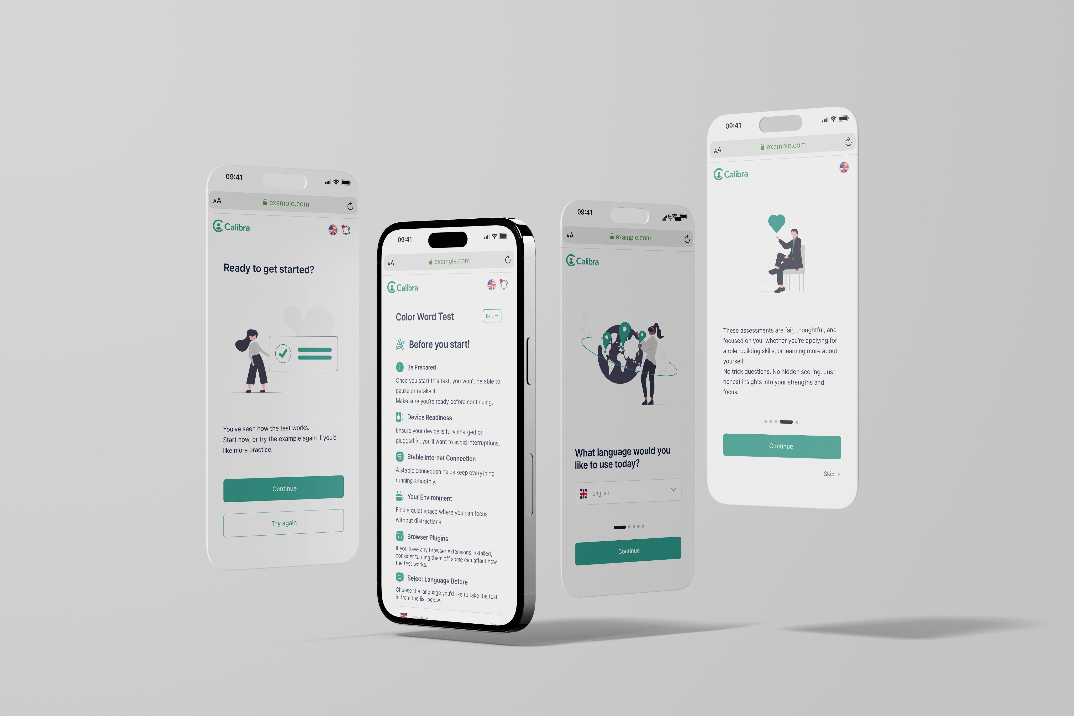
Cohr Group platform overview

Cohr Group is a SaaS platform used by HR teams and recruiters to assess candidates through personality, cognitive, and executive function tests. Candidates complete the assessments independently, often without knowing much about the process beforehand.

When I joined, the platform functioned technically but the candidate experience felt opaque and stressful. Candidates often did not understand why they were taking tests, how long things would take, or what would happen after completion.

Candidates had no context for what they were walking into.

What wasn't working:

Instructions were easy to skim past or misunderstand
The purpose of tests felt unclear
Progress and rules were not visible enough
The experience felt like a black box
Uncertainty increased test anxiety

In an assessment context, that stress has real consequences. It can affect how people perform, which makes the results less reliable for everyone.
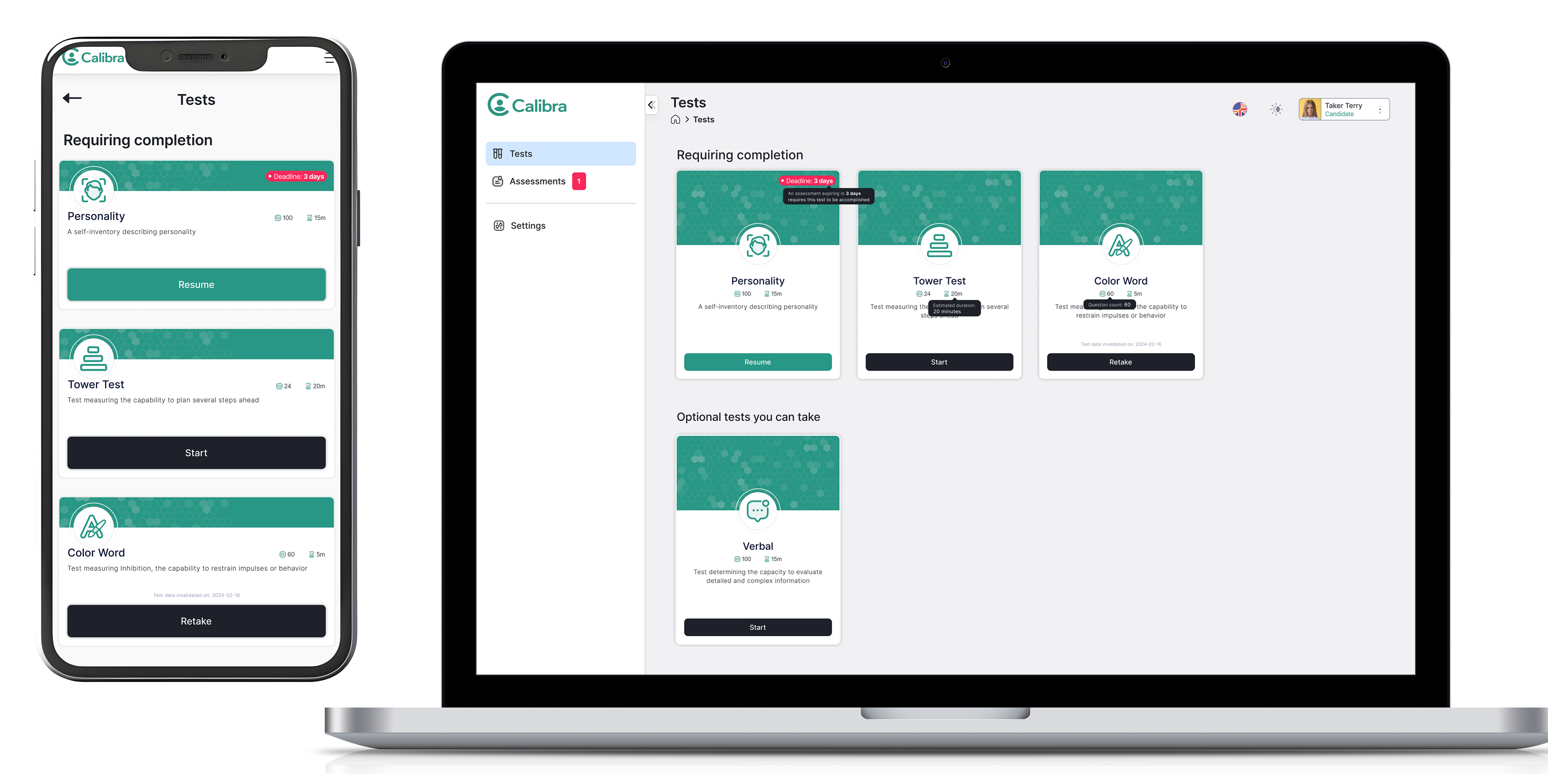

Original platform before redesign
The original platform before the redesign. No clear guidance, dense layout, and candidates had little context for what was happening or what came next.
Gap analysis: where candidates were left without guidance
Three critical moments where candidates were left without guidance: entering a test, between phases, and after completion.

This platform is used in recruitment and professional evaluation. Candidates are often already under pressure before they arrive. The design needed to:

Support focus without distracting
Explain enough without overwhelming
Be transparent without compromising assessment integrity

If candidates don't trust the process, the results don't mean much either.

I started by mapping the full experience to find where things broke down.

Going from first login to final results, I could see where candidates were being left on their own, mainly just before starting a test, between phases, and after finishing. Those gaps became the focus of the redesign.

Full user flow diagram
Full user flow: Login → Onboarding → Home → Pre-Test → Test → Post-Test Dashboard → Feedback. The repeating test cycle was the main area of redesign focus.

I restructured the platform around one question: what does this person need to know at this exact moment?

Home: status and next steps
Assessments: context and progress
Tests: focused, linear experiences
Notifications: blocking and non-blocking
Settings: intentionally minimal

The goal was simple: candidates should always know where they are and what's coming next.
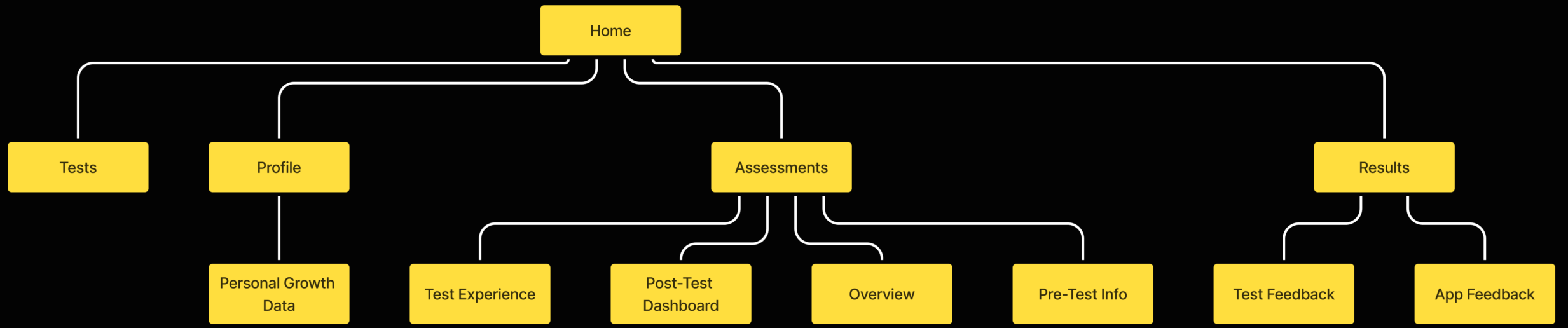
Information architecture diagram
Information architecture showing the five core areas of the redesigned platform and how they relate to each other.

Onboarding was redesigned to clearly explain what Cohr Group is and why it's used, what the candidate gains from the process, and time estimates and expectations. Before each test, pre-test screens clarified rules and resumability, device and environment requirements, and what type of tasks to expect.
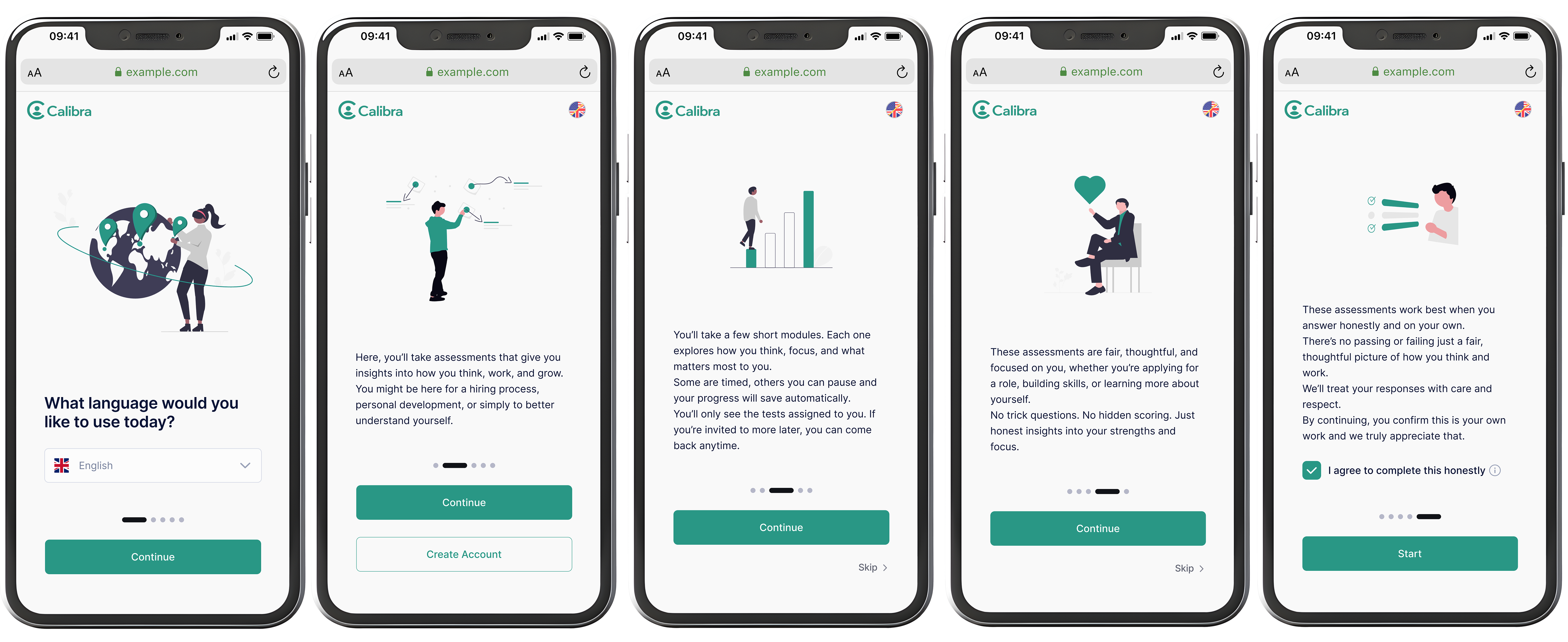
Redesigned onboarding screens
Redesigned onboarding screens: language selection, purpose explanation, what to expect, and why assessments are fair.

Tests varied widely in format and mechanics, but the experience needed to feel consistent. Each test follows the same four-step structure regardless of content type.

Test flow: Explain, Practice, Test, Confirm
Every test follows the same four-step structure: Explain → Practice → Test → Confirm. Consistency reduces anxiety across different test types.

Key design principles for the test UI:

Clear instructions per test and per phase
Trial questions where applicable
Visible progress indicators and timers
Minimal UI distractions
Consistent interaction patterns

The goal wasn't to make the tests easier, just to make sure the interface wasn't making things harder than they needed to be.
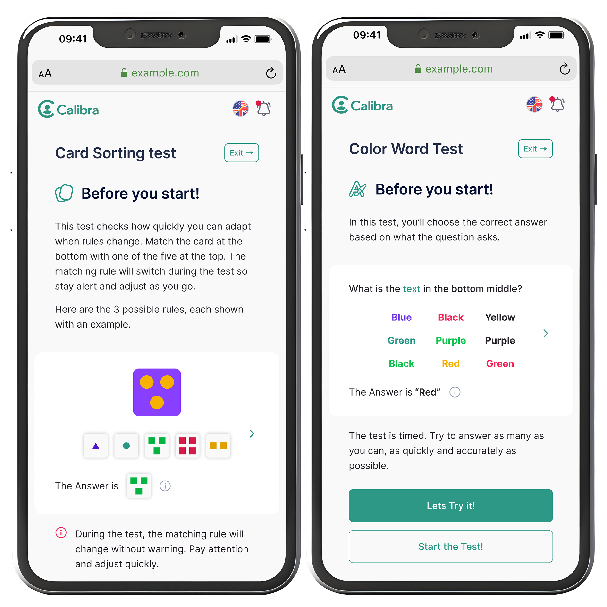
Test instruction screen
Before each test, candidates see what's being measured, how it works, and a worked example, so they're not going in blind.
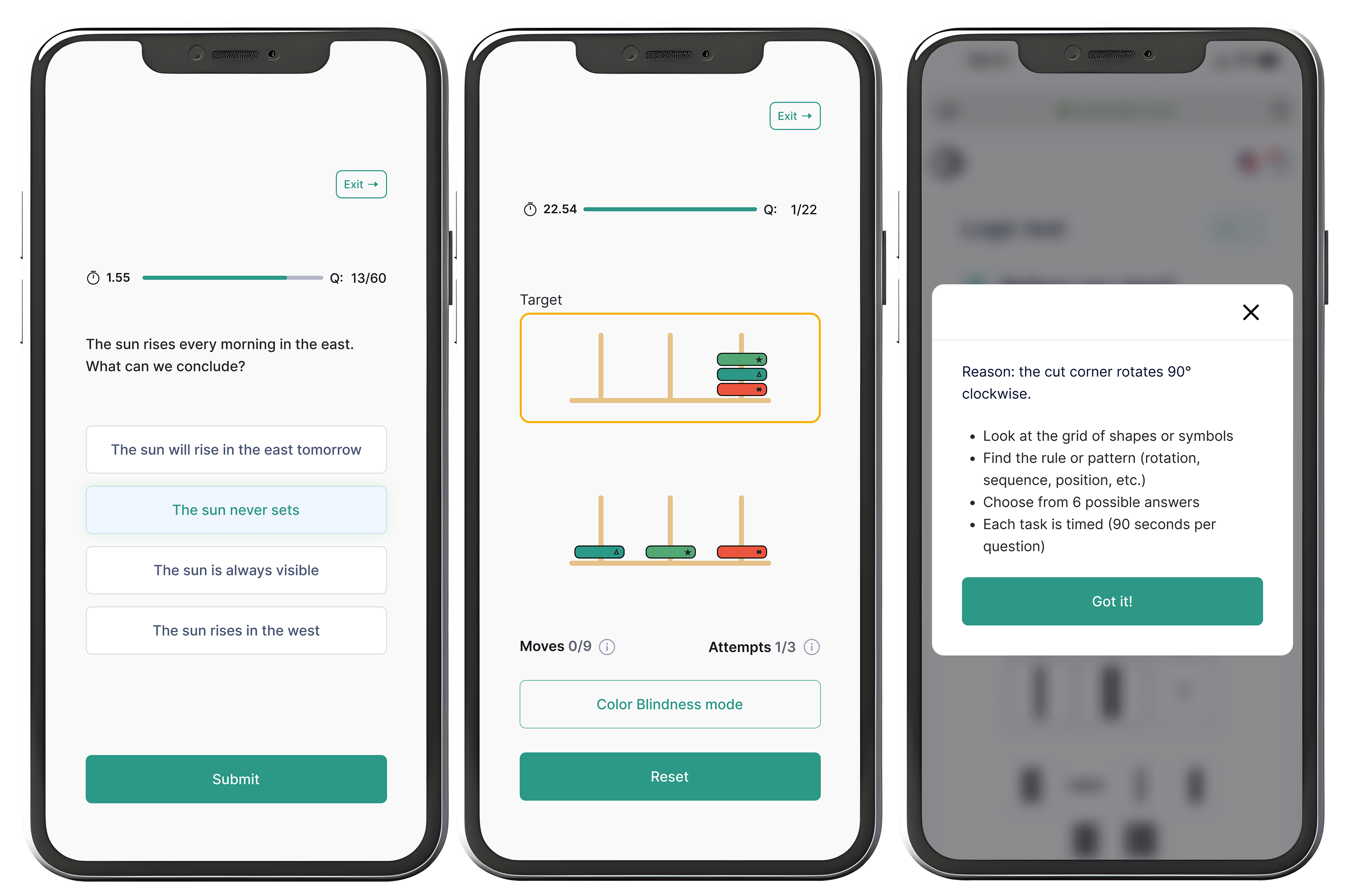
Test experience screens
Test screens across different assessment types. Timer, question count, and progress bar are consistent throughout. Each test type has its own interaction pattern but the same structural frame.

Results were designed to support reflection rather than evaluation:

Strengths and development areas
Visual explanations of scores and percentiles
Context around norms and interpretation
Neutral, human language

Candidates should finish knowing what happened, not wondering about it.
Results and completion screens
Completion and results screens. Candidates see their progress, completed tests, and a trait breakdown using neutral language and a sliding scale. The tone is encouraging without overpromising.

Key design decisions

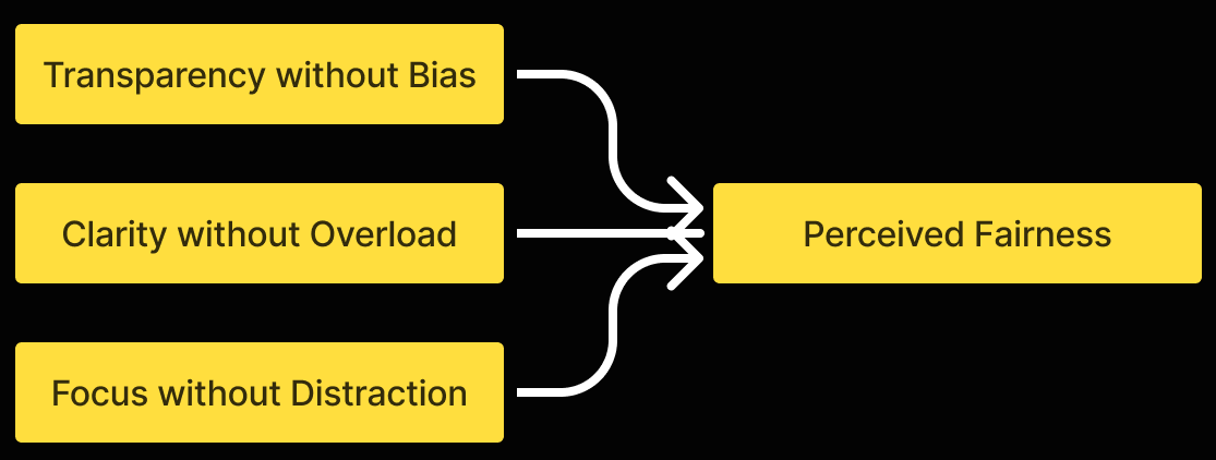
Core design principles
Three principles converging on perceived fairness: Transparency without Bias, Clarity without Overload, Focus without Distraction.
Linear flow over flexibility
Predictability over exploration to reduce cognitive load and test anxiety.
Transparency without full disclosure
Rules explained clearly, without exposing scoring logic that could bias behavior.
Partial feedback
Meaningful summaries to build trust, while protecting assessment validity.
Calm clarity over delight
Neutral design prioritised to support focus and emotional safety.

The redesigned experience gives candidates a clear path through what is, realistically, a stressful process. They know what's coming and what happens after. The interface stays out of the way.

After handoff, the feedback was positive. The main note I got was to trust my design decisions more, which honestly stuck with me.

"We were very pleased with the overall delivery and handover of the design by Farnoosh. She is highly professional, structured, and passionate about what she does and what she delivers to her clients. We can highly recommend working with her."

Mattias Holm, Chief Product Officer, Cohr Group

Sometimes good design is mostly about getting out of the way.

Working on this made me realise how much of UX in high-pressure contexts is about removing things rather than adding them. People don't need a slick experience. They need to feel like they understand what's going on.

If I did this again, I'd start with the full experience map before opening Figma. I did it partway through this project and it immediately changed my priorities.

Next project
Design Dashboard
For clinical trial tools to be more accessible
+46 (0) 737 528 390 farnooshdahesh@gmail.com LinkedIn