To bring clarity, hierarchy, and calm to a fast-growing research tool.
Puls Health Research is a digital platform connecting participants with clinical trials. The goal is to make research more inclusive, accessible, and user-friendly — especially for patients managing conditions like migraines, diabetes, or cancer.
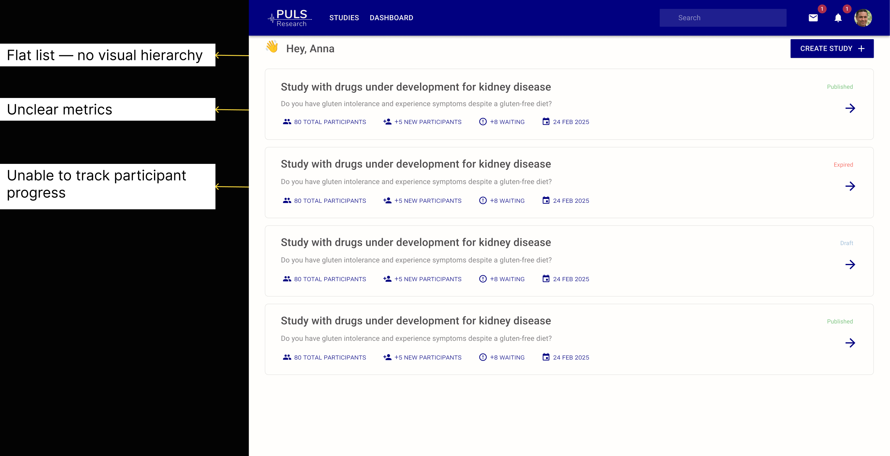
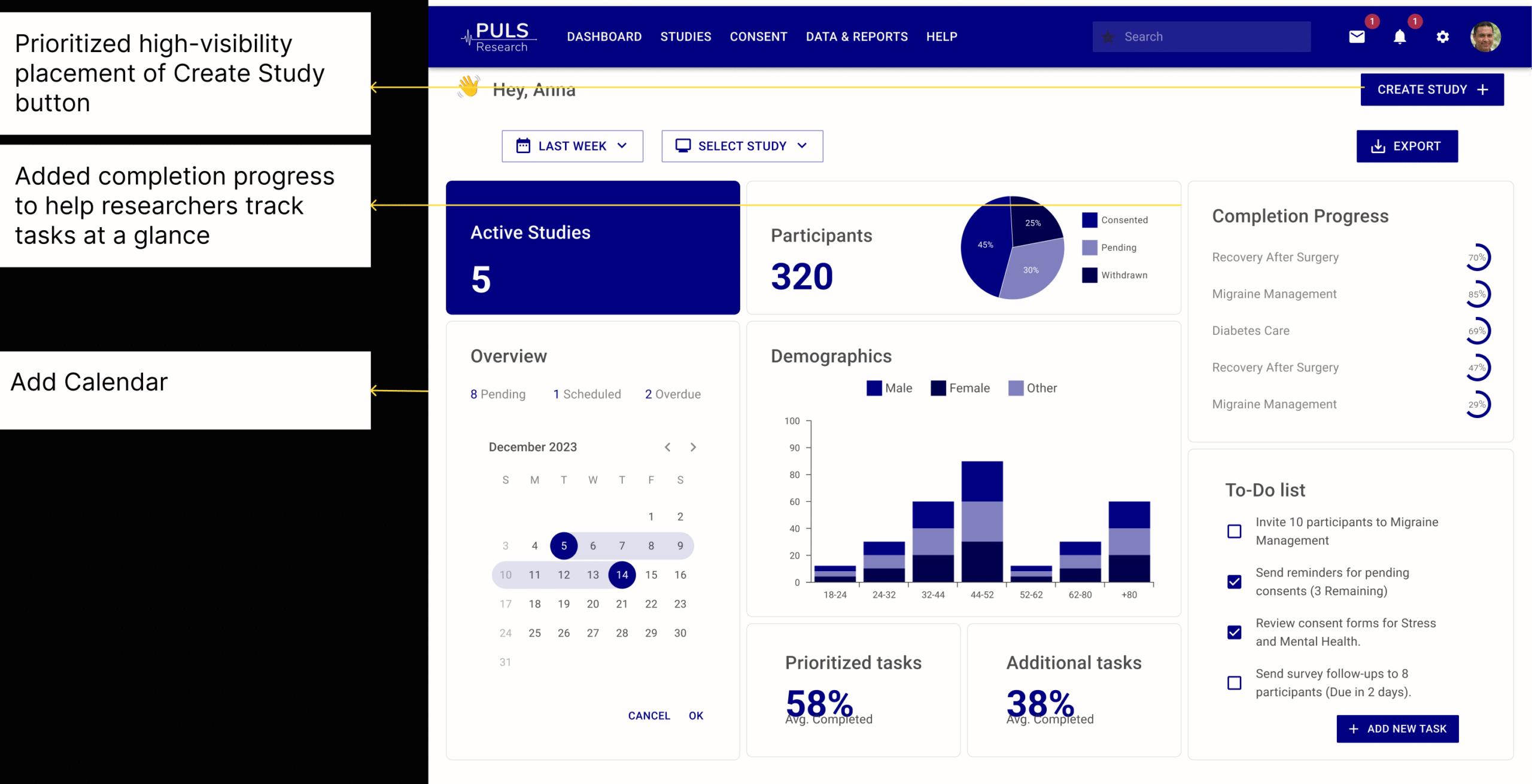
When I joined, the dashboard existed but gave researchers no real overview. Users could not find what they needed or understand what to do first. My task was to bring structure and readability to a tool that was functional but impossible to scan, while adapting to a mid-project shift from MUI to Lovable.
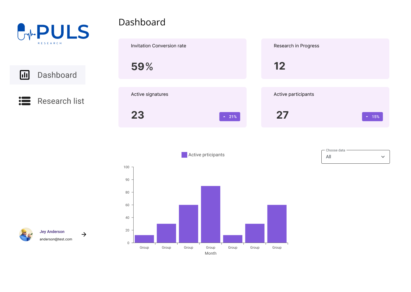
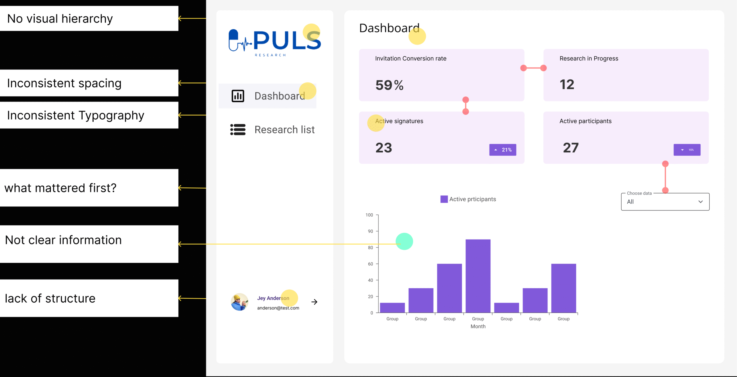
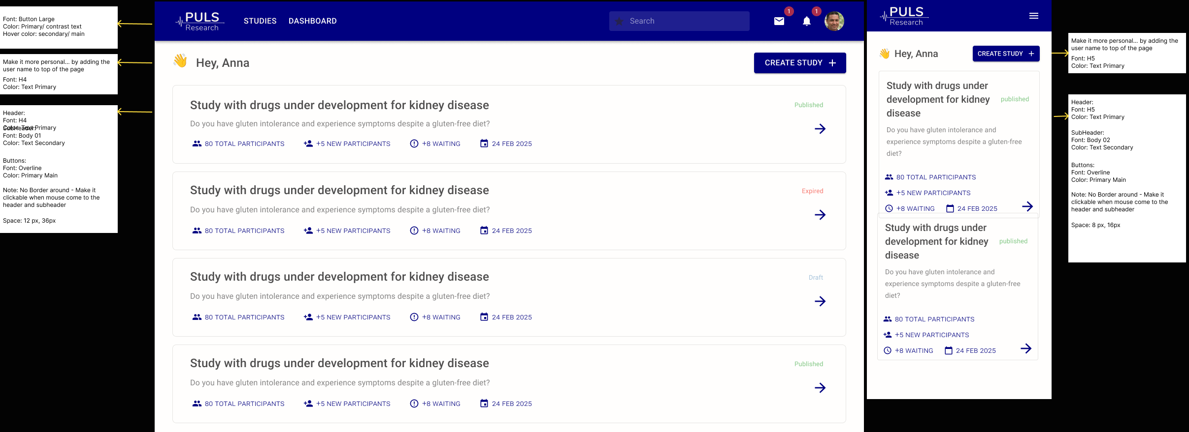
The developers' choice of MUI became my starting point. I focused on turning a minimal layout into a clear, structured dashboard. Each decision aimed to make information easy to scan and simple to build.
When Lovable replaced MUI mid-project, I mapped design tokens and colours across both systems to maintain consistency. The visual language stayed stable even as the framework changed.
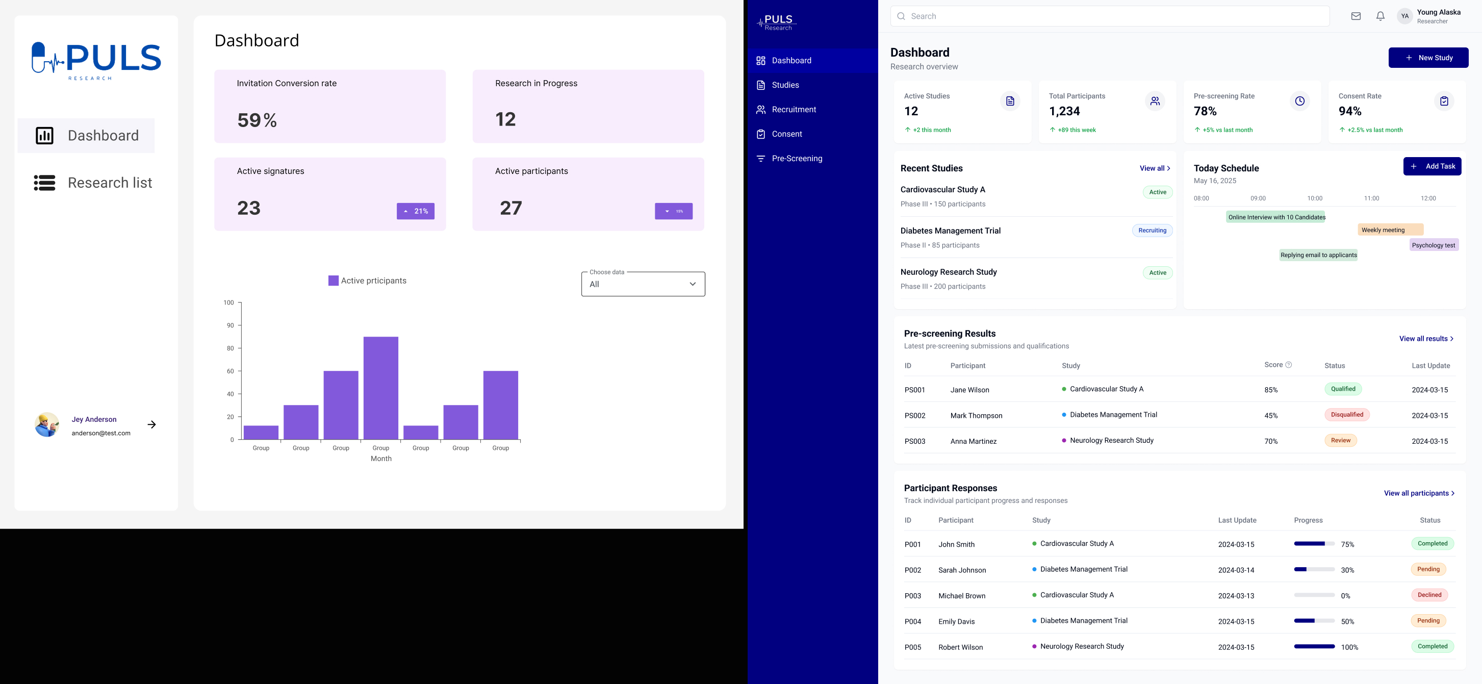
I tested two dashboard versions with researchers using Lovable, running short task flows and collecting feedback through Google Meet and Otter.ai.
Version B, with stronger hierarchy and clearer action points, was preferred in 4 out of 5 sessions.
The redesign created a foundation for scalable, consistent design. Researchers described it as "easier to read and less tiring." Developers reused spacing tokens across other views.
A solid structure survives any design system change. Document early — it saves time later. Simplicity builds trust faster than decoration.
What stayed with me most was how much the developer appreciated the documented design system. It made the handoff feel like a collaboration rather than a handover.