Designing for Trust in High-Stakes Moments
Company name and visual identity have been changed to protect confidentiality. The design decisions, structure, and approach shown here are my own work.
This project was not about making tests feel fun or easy. It was about removing everything that should not influence the result.
In high-stakes assessments, confusion is not a minor usability issue. It directly affects fairness, trust, and performance. When candidates are uncertain about what is happening or what comes next, that uncertainty can change how they perform — which undermines the validity of the whole process.
Calibra is a SaaS platform used by HR teams and recruiters to assess candidates through personality, cognitive, and executive function tests. Candidates complete the assessments independently, often without knowing much about the process beforehand.
When I joined, the platform functioned technically but the candidate experience felt opaque and stressful. Candidates often did not understand why they were taking tests, how long things would take, or what would happen after completion.
What wasn't working:
In an assessment context, this matters. Stress and confusion can influence outcomes, which undermines both trust and validity.

This platform is used in recruitment and professional evaluation. Candidates are often already under pressure before they arrive. The design needed to:
Failure here wouldn't just hurt usability. It would hurt perceived fairness.
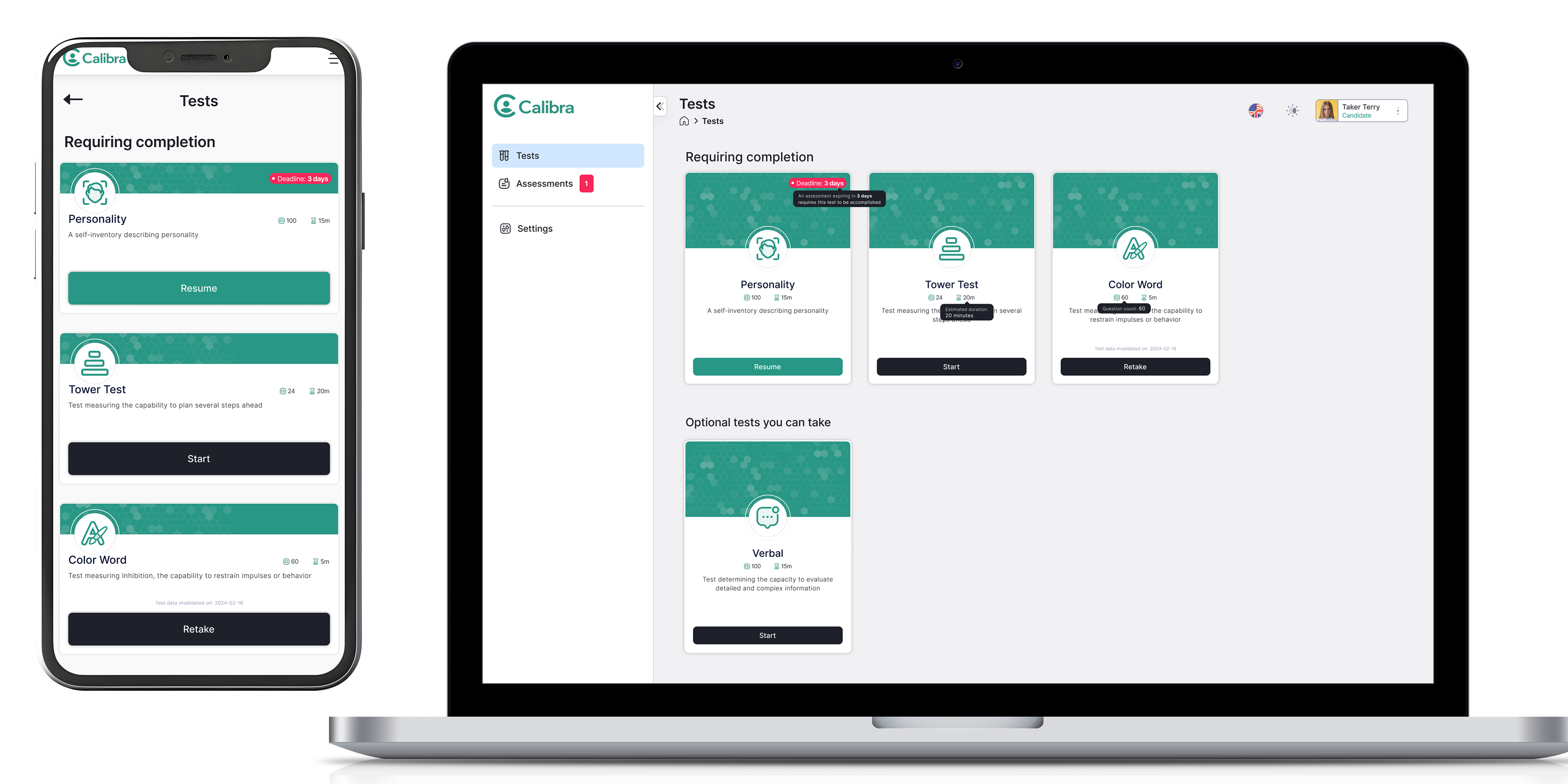
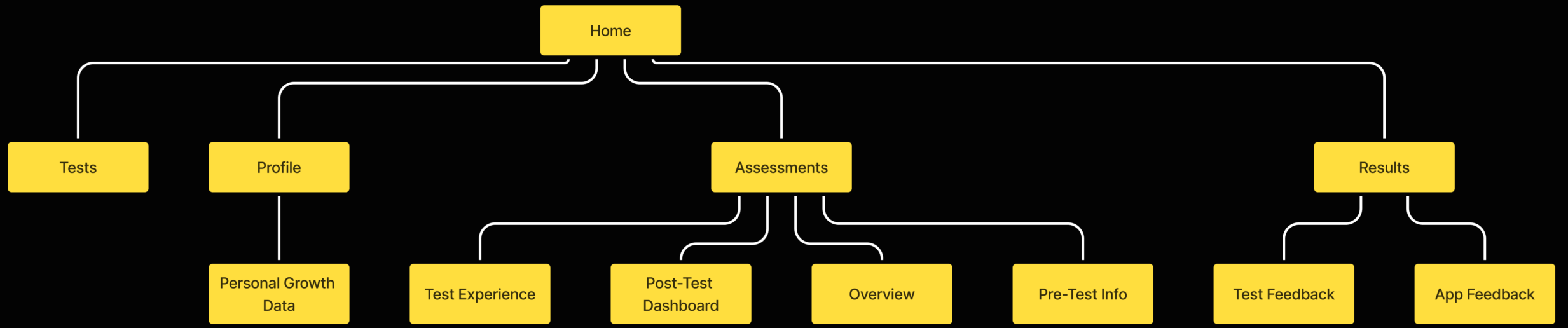
I mapped the full experience from first login to results. This revealed critical gaps — particularly before starting a test, between test phases, and after completing all tests. These moments became the priority areas for the redesign.
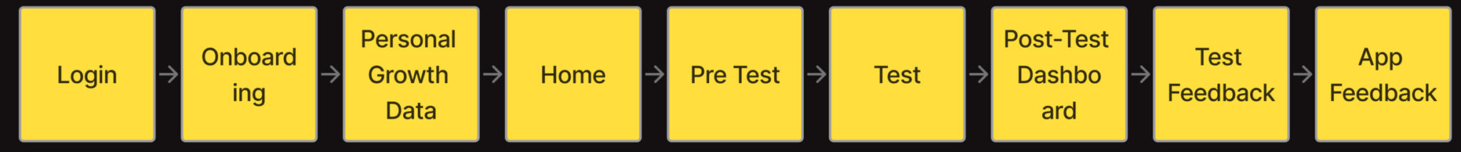
I restructured the platform around a simple question: what does the candidate need to know right now?
The goal was predictability. Candidates should never have to guess what comes next.
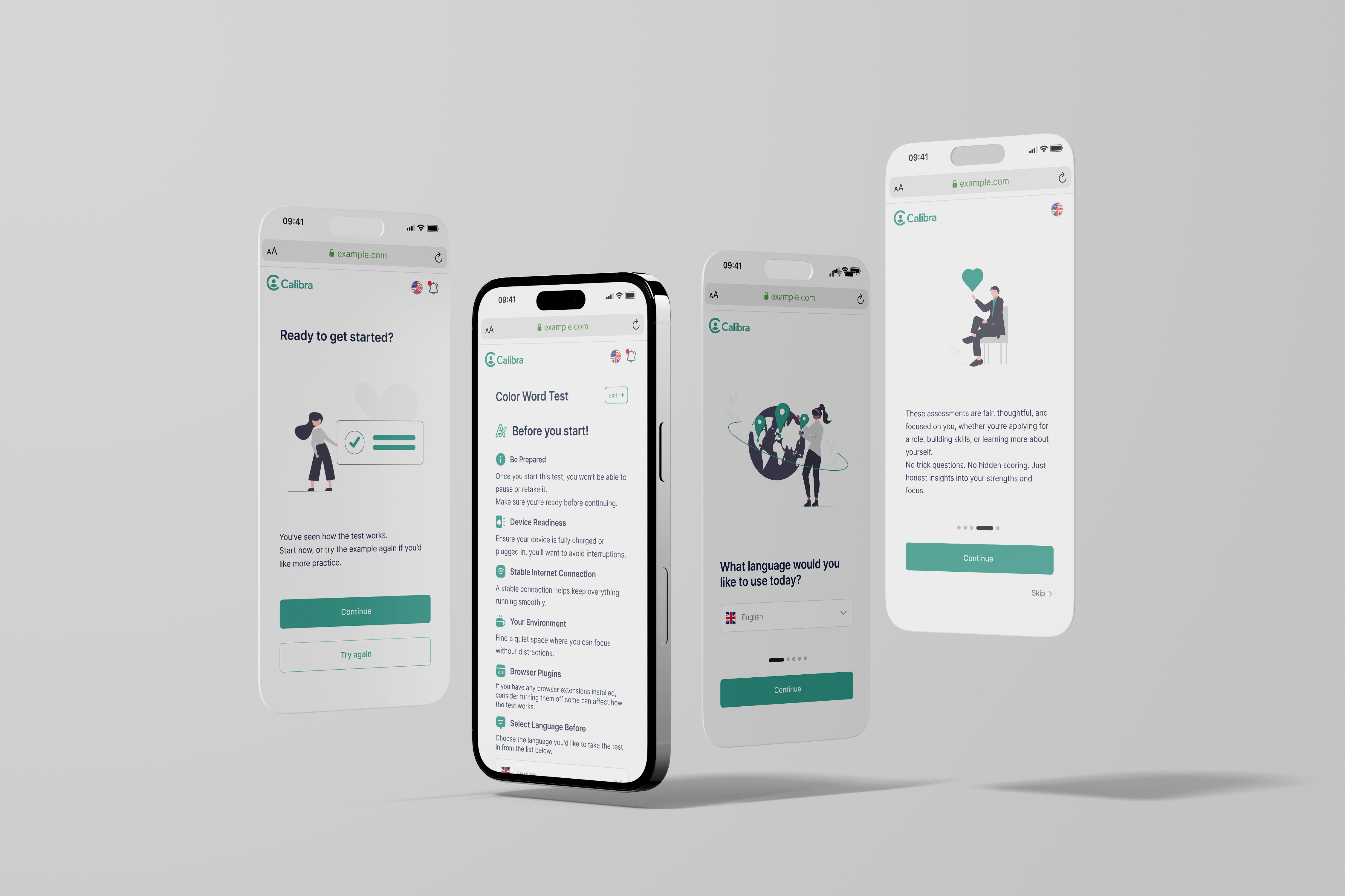
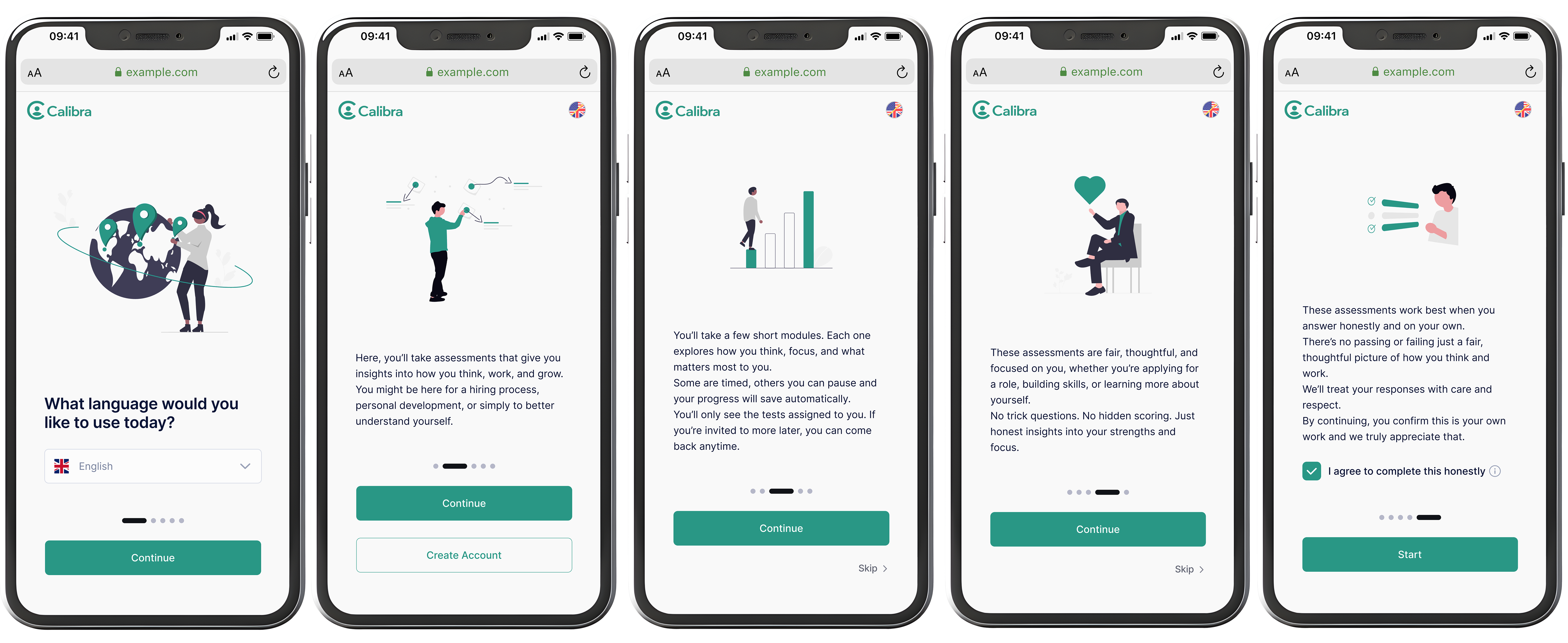
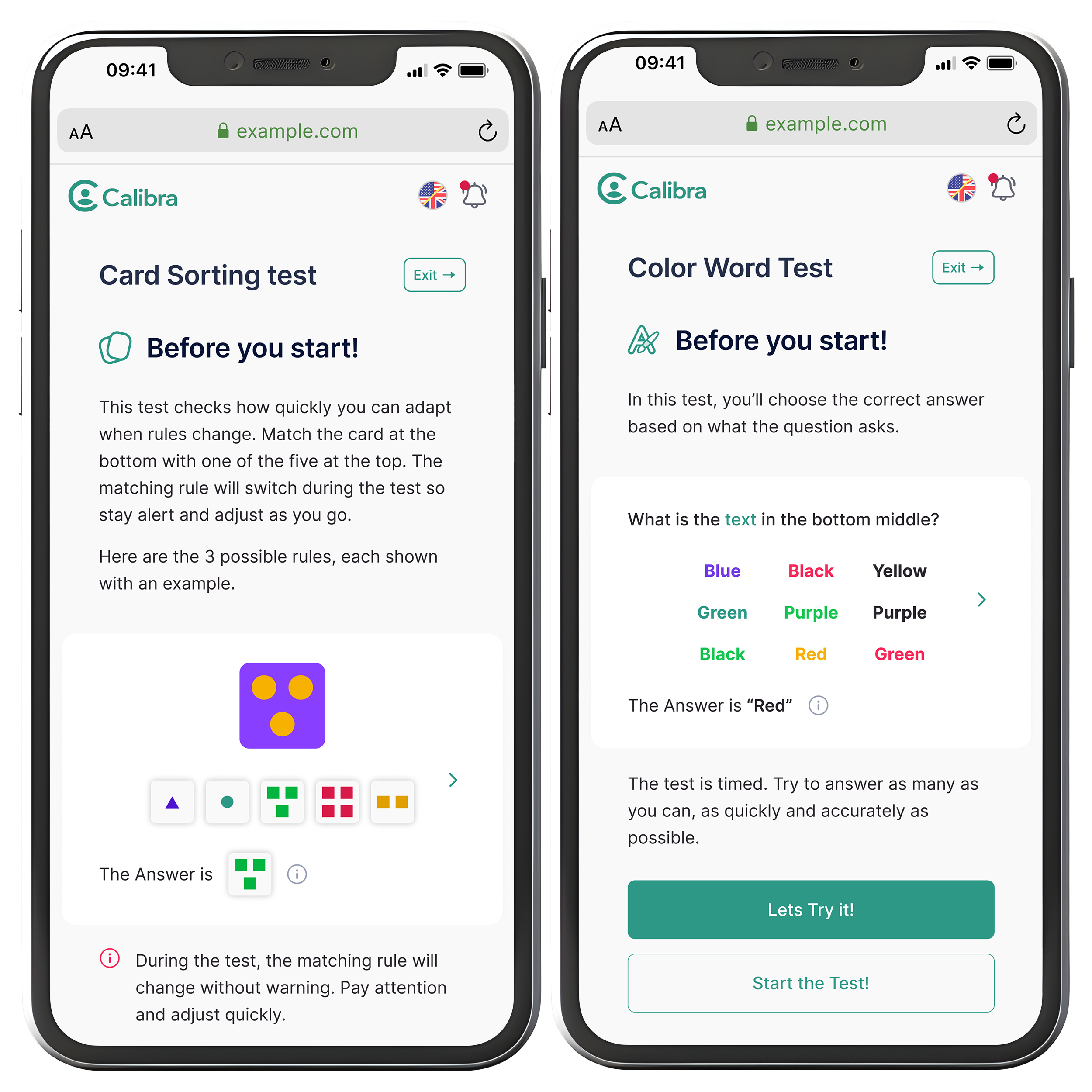
Onboarding was redesigned to clearly explain what Calibra is and why it's used, what the candidate gains from the process, and time estimates and expectations. Before each test, pre-test screens clarified rules and resumability, device and environment requirements, and what type of tasks to expect.
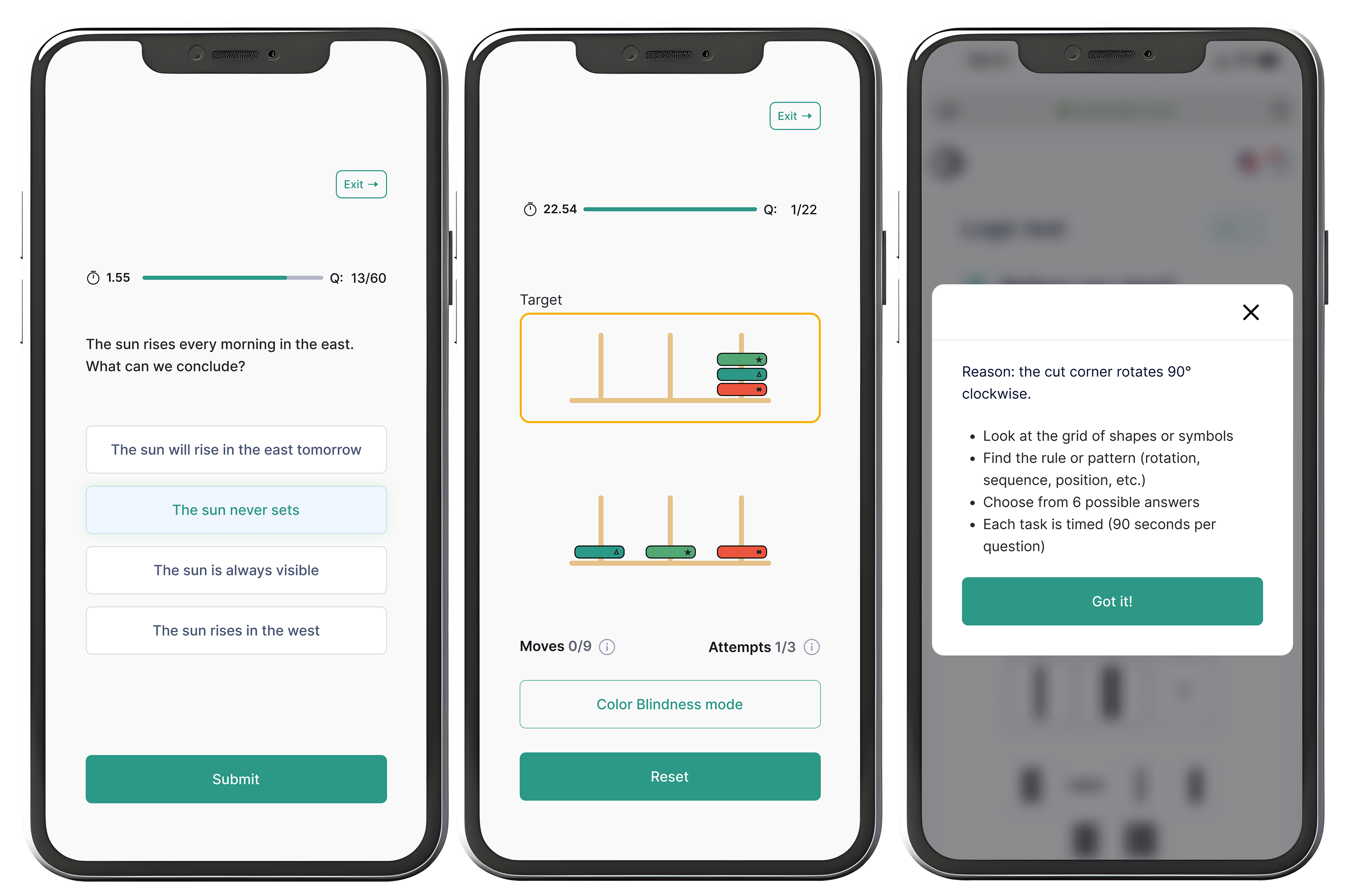
Tests varied widely in format and mechanics, but the experience needed to feel consistent. Each test follows the same four-step structure regardless of content type.
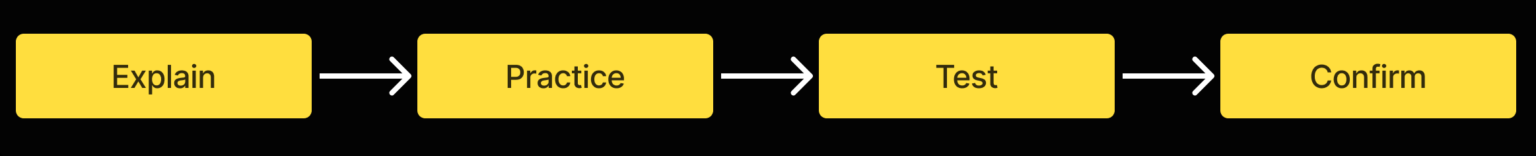
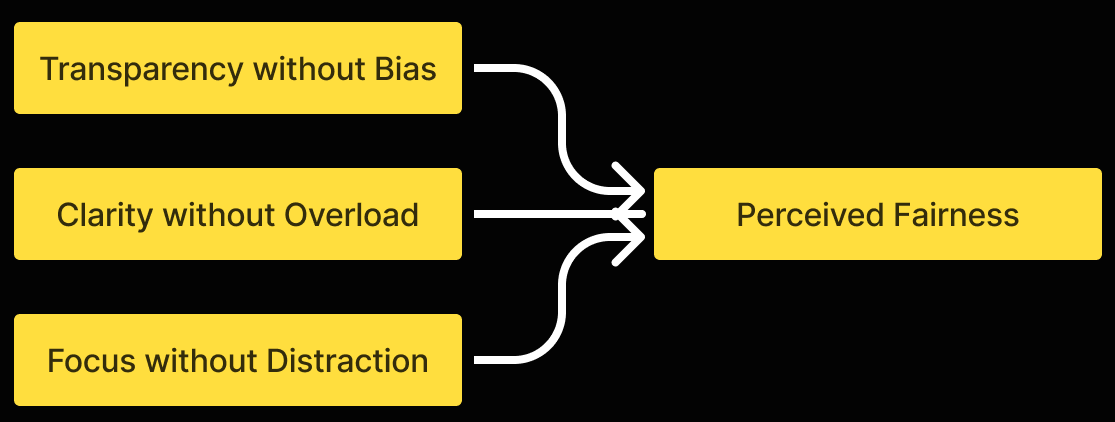
Key design principles for the test UI:
The aim was not to make tests easier, but to make them fairer by removing interface-related friction.
Results were designed to support reflection rather than evaluation:
Candidates should leave with understanding, not uncertainty.
The redesigned experience gives candidates a clear path through a high-pressure process. They know what is coming, why it matters, and what happens after. The interface does not compete with the task.
After handoff, the feedback was positive. The one note I received was to trust my design decisions more. That is something I carried into every project since.
When people are under pressure, clarity and predictability matter more than visual polish.
This project also taught me to focus on what to remove. By simplifying structure and language, an experience can feel fairer and easier to trust.
Next time I would map the full experience first, every time, before touching any UI.