to bring clarity, hierarchy, and calm structure to a fast-growing research tool.
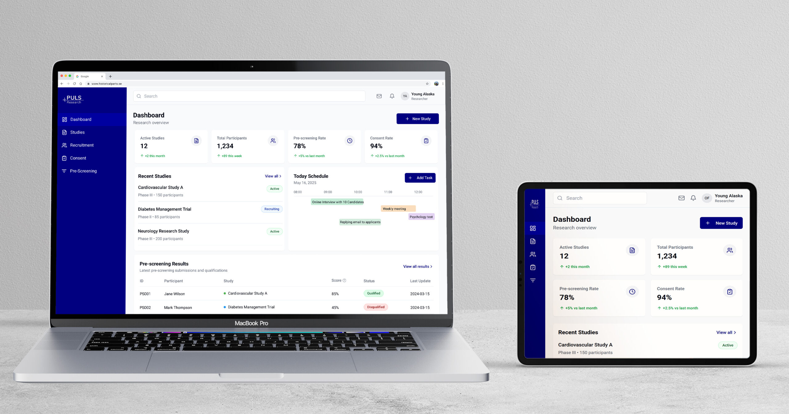
The goal was to redesign the internal dashboard used by researchers to monitor ongoing studies. The original version was functional but dense, not all needed data, little hierarchy, and inconsistent visual logic. My task was to bring order and readability while adapting to a system shift from MUI to Lovable. The result is a clear, accessible dashboard that supports quick decisions and scales easily.
Figma, Notion, Lovable, Otter.ai, Slack, MUI Design system
Client
Puls Health Research
(A digital platform connecting participants with clinical trials. The goal is to make research more inclusive, accessible, and user-friendly, especially for patients managing conditions like migraines, diabetes, or cancer.)
When I joined, the dashboard existed but offered little overview. Users were not able to find needed information or understand priorities. The developers had started using MUI, but the visual hierarchy and spacing rules were missing. My challenge was to design a structure that made sense to both users and the developer.
The developers’ choice of MUI became my starting point. I focused on turning a minimal layout into a clear, structured dashboard. Each decision aimed to make information easy to scan and simple to build.
Design focus:
Clear hierarchy and content flow
Modular layout that scales
Consistent 8-pt spacing and color logic
Smooth later migration to Lovable
It started as a skeleton, my goal was to give it structure and calm.
Building structure around MUI
Process
Layout
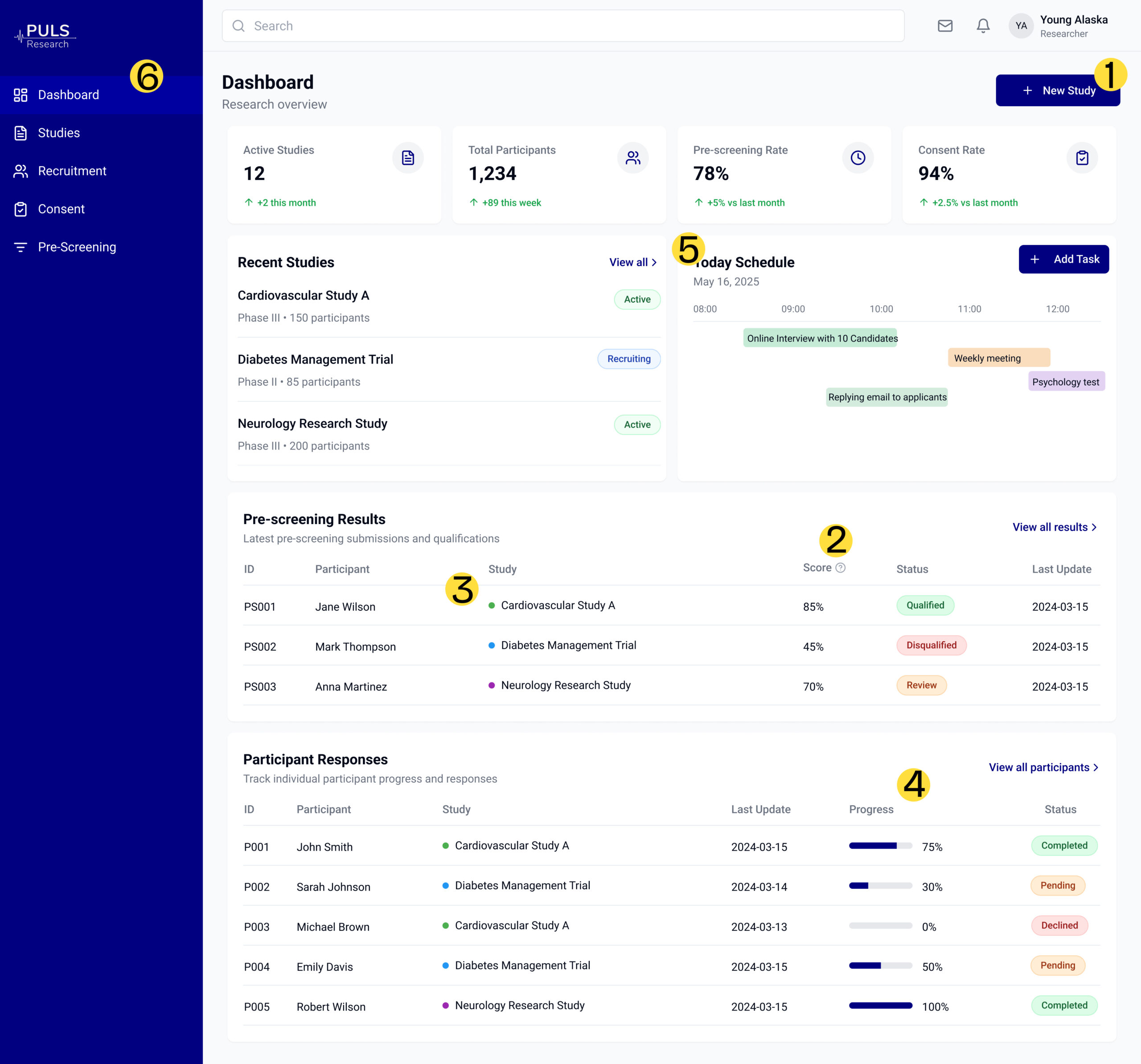
I re-organised the dashboard into three zones: Overview: key study metrics Tasks: daily actions Insights: visual trends Each module followed one spacing and colour system for a balanced rhythm.
System Transition
When Lovable replaced MUI, I mapped design tokens and colours to maintain consistency. The visual system stayed stable even as the framework changed.
Before& After
Collaboration
I worked closely with the developer, sharing annotated Figma files. Spacing, colour roles, and component states were clearly documented, reducing rework.
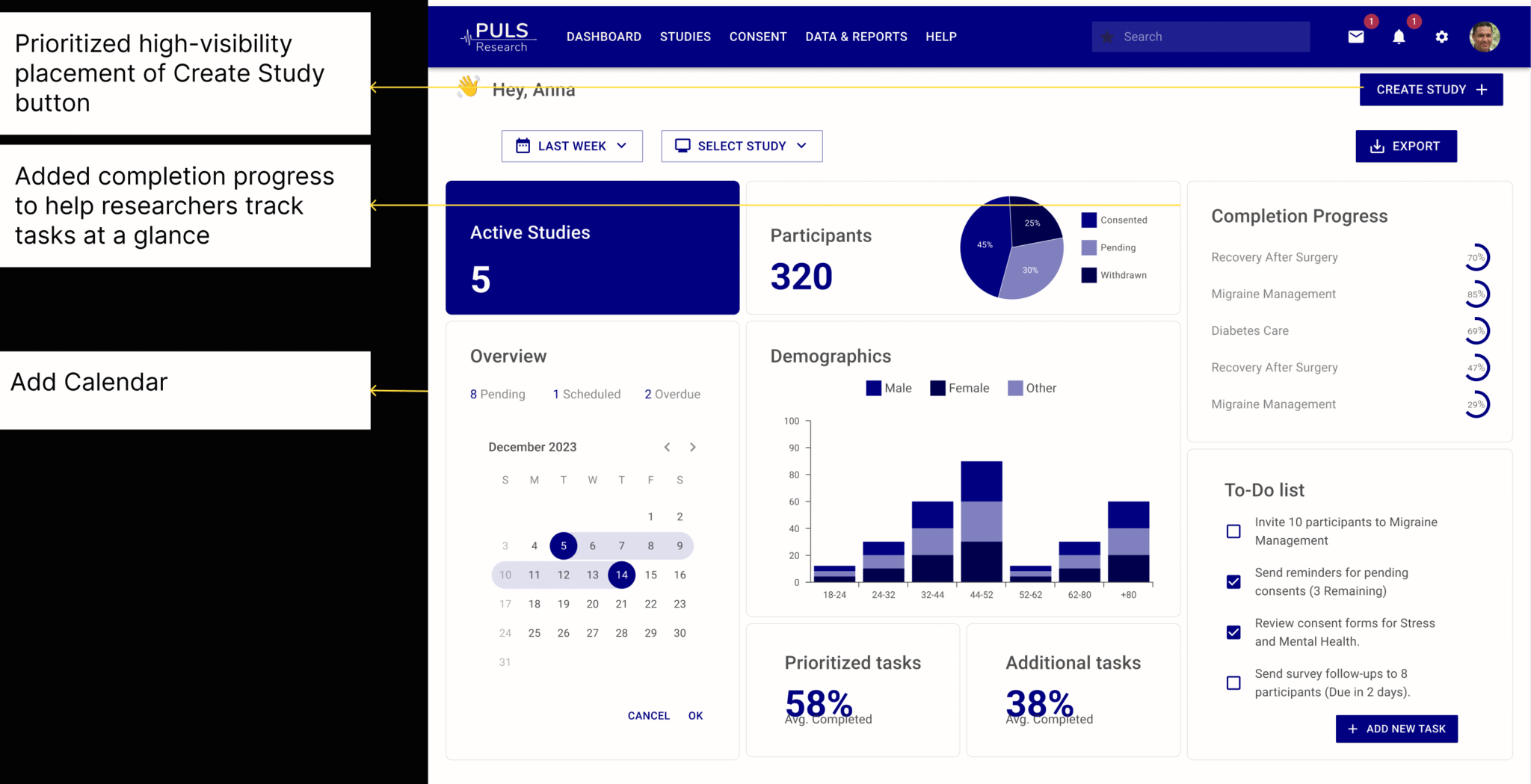
I tested two dashboard versions with researchers using Lovable, running short task flows and collecting feedback through Google Meet and Otter.ai. The goal was to identify where layout, clarity, and interaction could improve.
What I Tested
Can users easily find and use the “Create Study” action?
Is the Score label clear or confusing?
Can researchers quickly scan study cards and understand key metrics?
Does the calendar layout support managing appointments?
Does the interface feel intuitive on desktop and mobile?
Are filters easy to locate and use in the participant view?
What I Changed
Moved the “Create Study” button to the dashboard homepage for visibility
Added a “?” tooltip next to the Score label for quick explanation
Introduced colored labels to improve card scannability
Replaced raw numbers with visual indicators (bars, status chips)
Simplified the calendar layout for better readability
Merged filters into a unified sidebar for easier navigation
Version B, with stronger hierarchy and clearer action points, was preferred in 4 out of 5 sessions.
“Version B made it way easier to see who’s eligible.”
“I didn’t even notice the Create Study button before — now it stands out.”
“The calendar view feels more usable than the appointment list.”
The new dashboard feels structured and calm. Modules are scannable, spacing is even, and key data stands out through contrast. Users can now understand priorities at a glance.
The redesign created a foundation for scalable, consistent design. Researchers described it as “easier to read and less tiring.” Developers reused spacing tokens across other views.
Designing this dashboard was about creating order from almost nothing. It showed how structure and collaboration can turn scattered data into a calm, understandable system.