Imagine being excited to explore a menu but struggling with limited options and clunky navigation. The restaurant faced this exact issue—paper menus didn’t offer the flexibility or engagement customers needed. They wanted a responsive, interactive menu that made ordering effortless, allowed customization, and worked seamlessly across devices.
My Role
Visual Designer
My Team
5 UX designer
Duration
15 Jan 2024 - 8 Deb 2024 (3 weeks )
Tools
Figma, Figjam, Adobe Illustrator
I took the lead on designing a modern, intuitive menu that enhanced the dining experience. My contributions included:
Visual design: Crafting a cohesive style and responsive layout.
Accessibility: Ensuring the design was inclusive with high contrast colors, large touch areas, and clear labels.
User Interaction: Developing intuitive flows for browsing, customizing, and ordering.
Developer Handoff: Providing annotated designs and accessibility guidelines to ensure a seamless transition.
PROCESS
Understanding User Needs
We started by imagining what diners really want when they open a menu. Through competitor analysis and brainstorming, we identified key user expectations:
Clear navigation to explore the menu quickly.
Intuitive customization options to personalize meals.
A visually engaging and responsive design for any device.
Creating a Cohesive Design Style
To reflect the restaurant’s brand and enhance usability, I developed a style guide:
Colors: A vibrant palette of warm tones to evoke energy and appetite, balanced with neutral accents for clarity.
Typography: Clean, modern fonts that prioritized readability.
Icons: Simple and recognizable symbols for navigation and interactions.
This guide ensured every design element worked harmoniously.
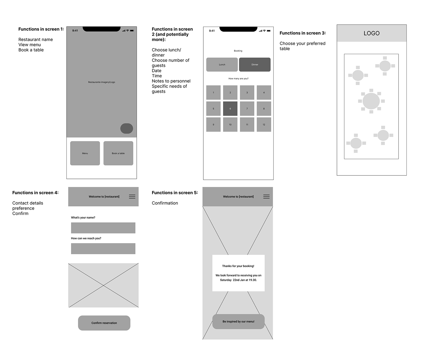
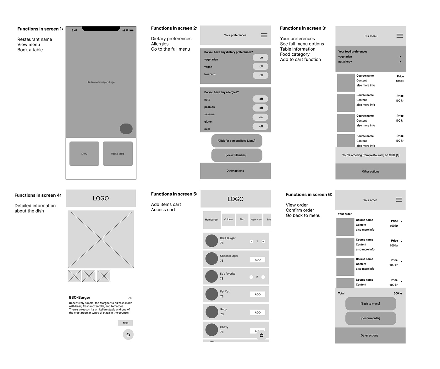
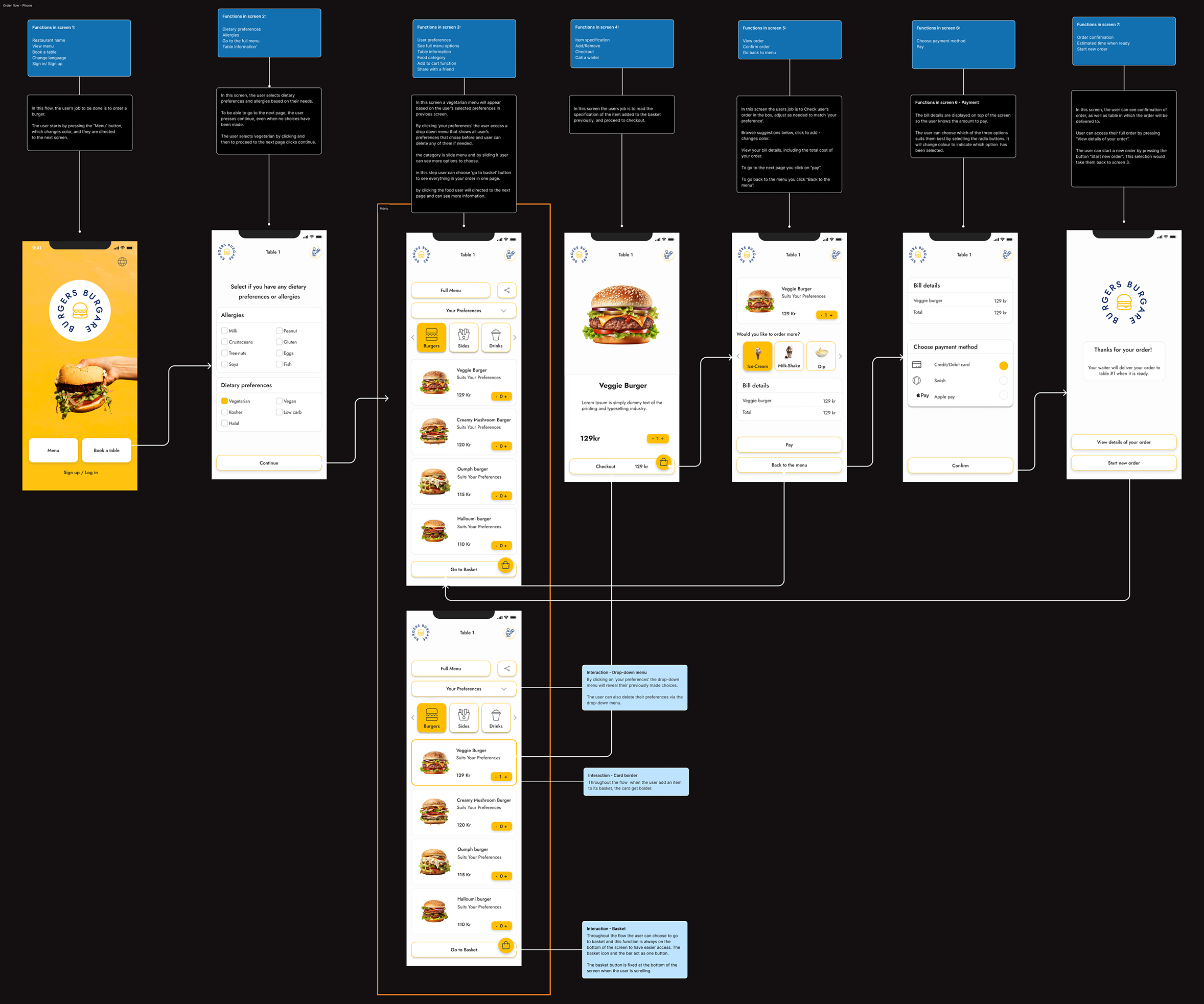
Designing an Intuitive User Experience
The focus was on creating a streamlined flow that allowed diners to:
Browse the Menu: Discover items with clear categories, descriptions, and images.
Customize Orders: Add or remove ingredients with interactive toggles.
Make Reservations or Takeout Orders: A flexible system for booking tables or selecting pickup/delivery options.
To ensure the menu was inclusive, I incorporated:
High-contrast colors to improve readability in all lighting conditions.
Large touch targets for mobile users to avoid interaction errors.
Alt text for images to support screen readers.
Preparing for Development
A key part of the process was ensuring a smooth handoff to developers. I provided:
Annotated Designs: Detailed notes on spacing, typography, and interaction states.
Accessibility Guidelines: Clear instructions to maintain inclusivity in the final product.
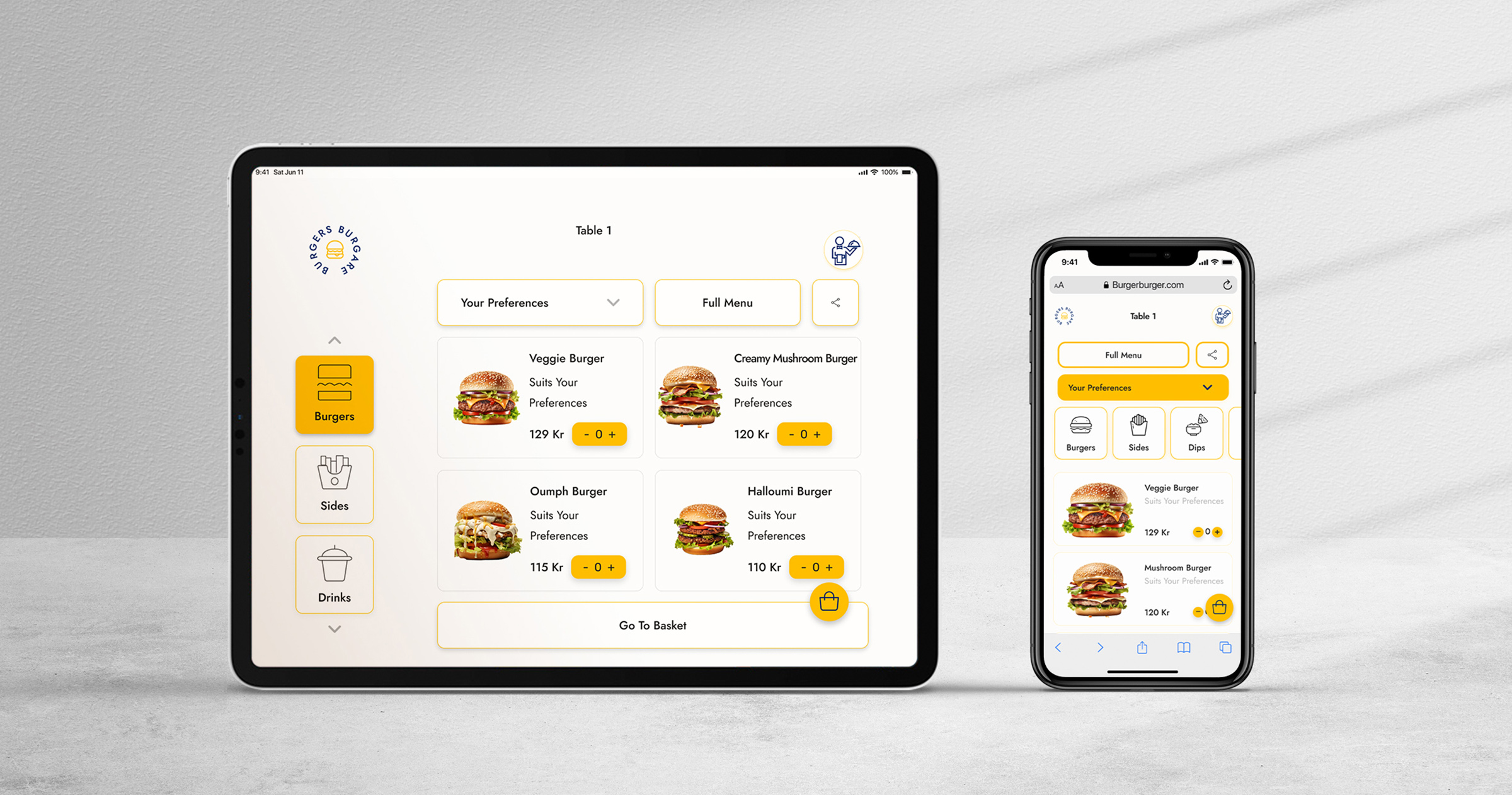
Final Design
The final interactive menu transformed the dining experience by:
Engaging Customers: Vibrant visuals and customization features made exploring the menu enjoyable.
Streamlining Operations: The intuitive flow reduced ordering errors and saved time for staff.
Ensuring Accessibility: Positive feedback highlighted the inclusive design, especially for mobile users.
Customers praised the seamless interface, and the restaurant saw increased engagement with meal customization and reservations.
Future considerations
While the interactive menu successfully transformed the dining experience, there are opportunities to enhance it further:
Enhanced Analytics Integration: Implementing data tracking to understand user preferences and improve menu optimization.
Voice Accessibility: Adding voice navigation features to make the menu even more inclusive for users with mobility or visual impairments.
Multilingual Support: Expanding the menu to include multiple languages for a broader audience.
Offline Mode: Allowing customers to browse the menu even without an internet connection for added convenience.
These additions would further elevate usability and engagement, ensuring the menu continues to meet evolving customer expectations.
Project Takeaway
This project reminded me why I love design—it’s about solving real problems creatively while making everyday experiences more enjoyable. Transforming a simple menu into an engaging, inclusive tool was deeply rewarding, and it reinforced some key lessons:
Empathy is key: Understanding user needs is the foundation of great design.
Accessibility enhances usability: Inclusive designs benefit everyone, making the experience seamless and welcoming.
Collaboration matters: Clear communication and detailed handoffs are essential for bringing designs to life effectively.
This project not only highlighted the impact of thoughtful design but also deepened my appreciation for the power of accessibility and teamwork.


